
I was recently reminded of the number of graphics and particularly things like change curves, charts and other line or bar charts. Any discussion about change would not be complete without referencing the Kubler-Ross grief curve and Johari windows and when I was considering how I explain change management to people who ask, I always like to reflect in stories and pictures – it just seems to hold better with people.
Kubler-Ross
If you are interested in knowing the background to Kubler-Ross I suggest you Google it, I am not going to take up a large chunk of this space but it’s well used to express the emotional energy experienced through a period of grief following a death or bereavement of some form. Actually, as I’m sure you already link, death or bereavement can equal loss which in turn can reflect a change – letting go of something that was and trying to take on something that is to be. I’ve slight modified the Kubler-Ross curve to reflect this.
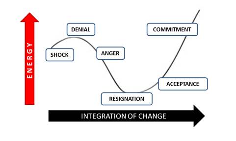
As the change is established in the organization, different reactions occur – the same as the Kubler-Ross model. But I use this to reflect that the amount of energy expended on each reaction is reflective of the height on the curve and the transition from one reaction to the next is reflective of the move from change creation to full integration – from shock to commitment!
Johari Window
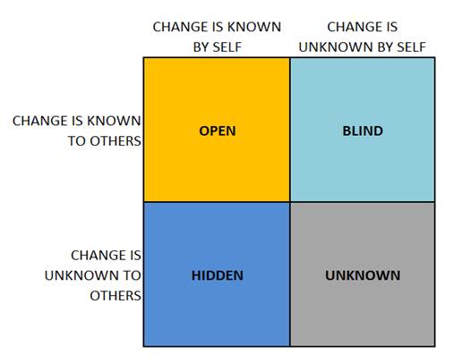
The other graphic I like to use is my own version of a Johari window. For those not so familiar with it, the Johari window comes from psychology and the willingness of people to understand what parts of their personality is accessible and open to others. hguhf h,k ghdk It is probably linked to my interest in Myers-Briggs typing that led me into looking more closely at this. دومينو اون لاين
If you replace personality with change then it works well as a descriptive model about the level of knowledge of that change within an organization. Consider that every stakeholder will sit somewhere on here and the challenge is enlarge the yellow coloured open sector, shrinking the blind and hidden blue shaded areas and thus shrink the unknown area. كيفيه لعب الطاوله In effect delivering knowledge about a change – and this relates to my favourite discussion on communications – when done successfully, will create more open zone content and less in the other zones.

What I personally find interesting here and I’ve tried to reflect it in my descriptors is how people sit in the “blind” and “hidden” change areas. When the change is known by the department, division or business managers but not the people within it, the “workers” are blind to it – they cannot see the change. If however the people that do the job are aware of a change, but have not passed on the information to departmental or project leaders, then they are keeping it hidden. Then of course the unknown quadrant occurs where nobody affected by the change knows about it! Which is where the hard work needs to take place!
I often use this Johari Change window to reflect the amount of communications needed. Those in the tope left corner need the least as they are better informed and those in the bottom right are in need of the most communication. There are multiple overlaps with stakeholder mapping and change impact analysis but it is a relatively simple for most people to understand.

Leave a Reply
Want to join the discussion?Feel free to contribute!